


6 Simple Ways to Add a Splash of Colour to Your Kitchen
The use of colour is a powerful design tool. When it comes to choosing the perfect colour scheme for your kitchen, you may often find yourself overwhelmed by the incredible choice of colours. Introducing colour to a neutral palette can often be intimidating but when planned and carefully considered, it can recreate your entire kitchens aesthetic that is pleasing on the eye.
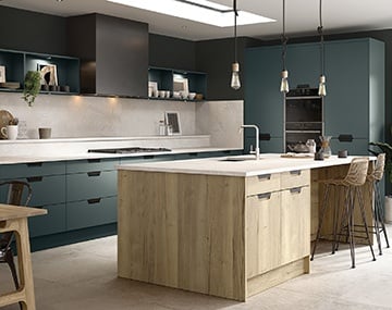
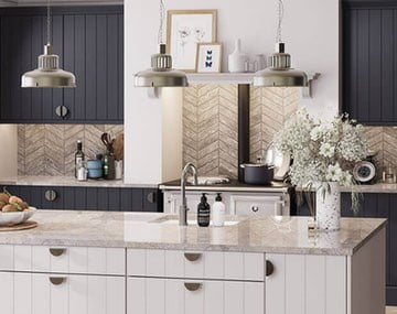
For dark statement kitchens, pair it with different textures such as stone, wood or metal. Include effective lighting and colourful accessories to transform your kitchen into a modern muse.
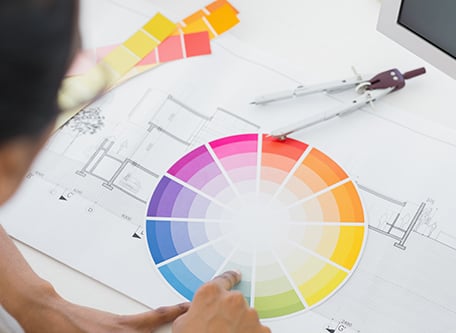
It’s important to understand how colours can be used together to create the best look. In the case of colour, opposites really do attract. It might be a good idea to use our colour wheel to pair colours and experiment to see what works best for you.
The Craft of Colour
Understanding how colours should be used together will help you to select complementing or contrasting pairings depending on your desired effect. There is a logical structure to mixing colour. You’ll recall being taught about primary colours in your early infant years and how when you mix these together, you create a new pallet of colours known as secondary colours. As long as you understand how a colour is made up and its position in the colour wheel, you can’t really go wrong.
Complementary colours: is where opposites attract. Choose colours that appear directly opposite one another on the colour wheel for a vibrant contrast. Complementary colours are the perfect way to create something that will stand out, just be careful not to over-do it. When used at their full saturation, they can be overpowering so consider different shades and tones that will create an equally contrasting effect.
Analogous colours: are 3 colours that appear side-by-side on a 12-part colour wheel to create a more relaxed and comfortable vibe. Analogous colour schemes are commonly found in nature and are pleasing to the eye. Whilst choosing three colours that appear side-by-side are harmonious, they may not be contrasting enough. Choose one colour to dominate with a second colour to support. The third colour should be used along with black or white to accentuate the scheme.
Triadic colours: are 3 colours positioned at 120 degrees from one another. The triadic colour methodology is commonly used to create vibrant colour schemes. Choose one of the colours to dominate and the other two to accent to create a well-balanced palette.
Tint, shade & tone: A tint is where a colour is mixed with white to increase the lightness of the colour. A shade is where a colour is mixed with black to reduce its lightness. A tone is a product of mixing a colour with grey or by tinting and shading a colour. The result of these mixing methods is an infinite number of colour variations.
It’s obvious that you can add colour by painting your kitchen walls so this article explores other ways to style your kitchen's interior. Don’t forget that feature walls can be created using a bold colour or patterned wallpaper. If you have an untouched brick wall, leave it exposed for added texture that is on-style!

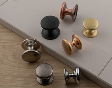
1. COLOURED KITCHEN DOORS
The simplest way to add colour to your kitchen is through your cupboard doors. Whether you are choosing a brand-new kitchen or want to revamp your existing arrangement, coloured doors are an effective way to transform your space.
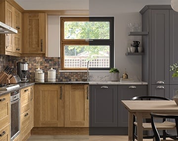
Natural earth tones bring a sense of warmth and comfort and can be easily included by using wood effect kitchen doors. Cool shades of white, grey and blue are calming and contemporary, and reflect light well, giving the illusion of a wider and brighter room. Cool shades with a gloss finish are a popular choice of kitchen door for smaller layouts as they radiate light so well.
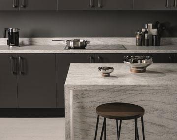
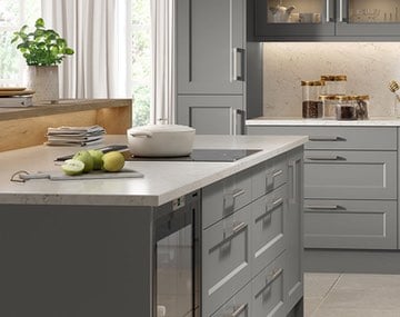
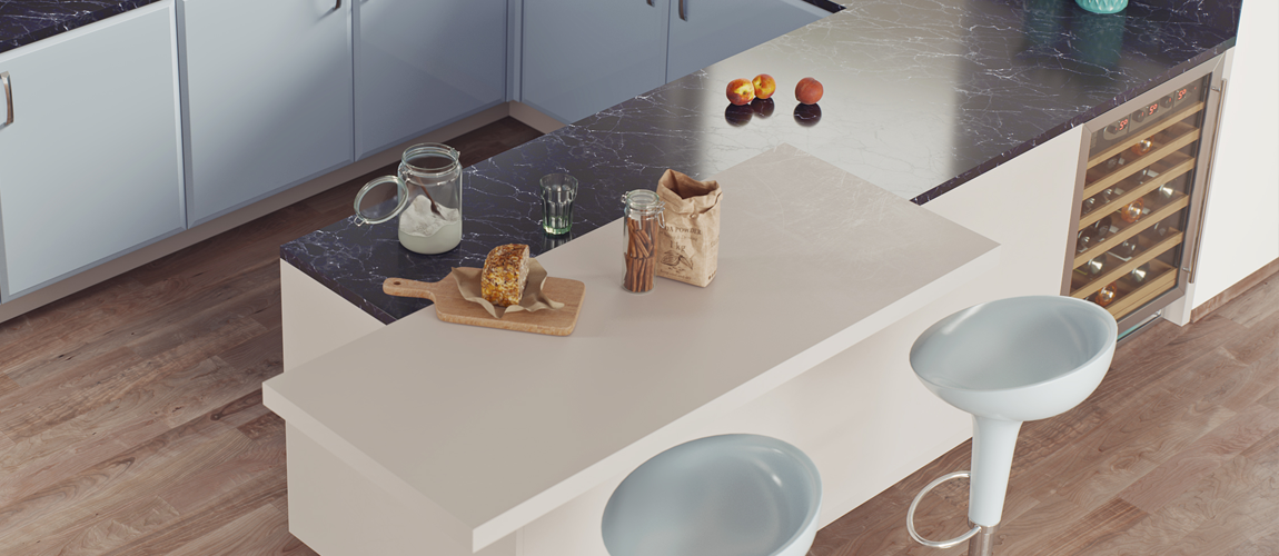
Create a feature of your kitchen island. The focal point an island provides is a fabulous opportunity to add depth to your kitchen. Opt for a contrasting island to give your kitchen an eye-catching feature. It can be created by coloured units for added vibrancy or a contrasting tone, or by units of a different texture to add depth.
You don’t need to go bright or bold to see a big change in your kitchen. Our kitchen cupboard doors are made to measure in different styles and colour options to help recreate your kitchen. Check out our favourite kitchen colours for inspiration.
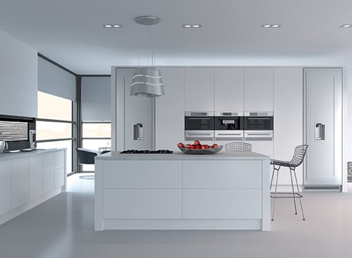
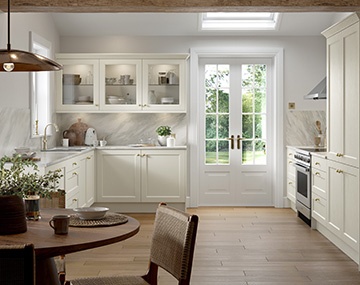
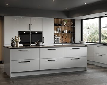
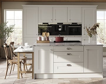
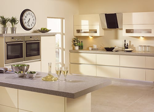
WHITE KITCHENS
A white kitchen is a timeless classic that is a popular choice for kitchens of all sizes. It’s simple, fresh and helps give the illusion of wider rooms and larger spaces by reflecting natural light. A white kitchen provides an open opportunity to introduce colour through flooring, worktops and accessories that can be regularly updated without the upheaval of changing your entire kitchen.

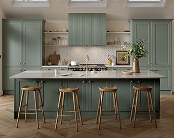
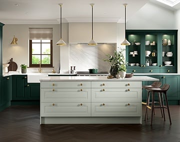
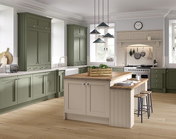
GREEN KITCHENS
Green kitchens have been extremely popular for many years as they are traditional yet fresh. Green cupboards can be complemented with a wooden worktop or contrasting wood grain cabinets to recreate a natural environment in your home. Take inspiration from the green hues of foods from within the kitchen like celery, olive, mint or lime.
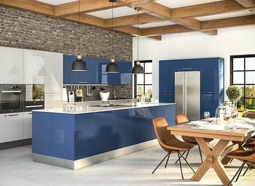
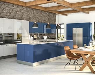
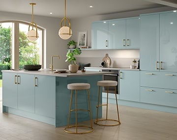
BLUE KITCHENS
Despite common belief, blue kitchens don’t have to be cold. Blue is associated with calmness, tranquility and helps to reduce stress. Cool shades of blue are peaceful and help intensify the perception of space whilst mid-dark tones are luxurious and can create a sense of coziness. Choosing a navy blue kitchen is less harsh than black and provide a grand canvas for colourful accessories.
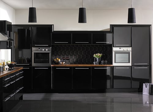
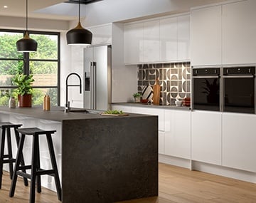
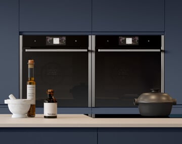
BLACK KITCHENS
Black is sleek and sublime. It has a definitive presence that oozes luxury and grandeur. Black kitchens are a bold choice that can be paired with different textures and colours for a contrasting effect. Bright colours will really pop against black or pair with metal or natural wood or stone for added depth and texture.
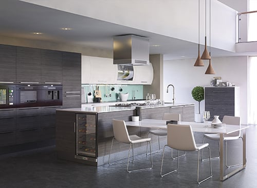
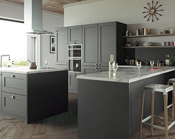
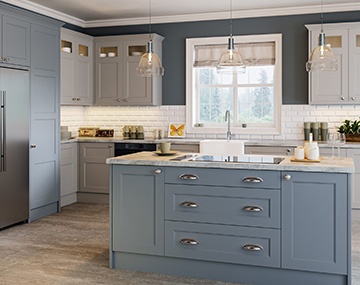
GREY KITCHENS
Subtle tones of grey have been used in kitchen design for many years, commonly found in classic and traditional kitchen designs. Due to its timeless elegance, grey has increased its popularity and is now a widely chosen alternative to contemporary white units. It’s soothing and stylish, and can easily be paired with bright colours that can really pop. Dark charcoal tones are a great alternative to black or navy blue kitchens that offers the same luxurious style.
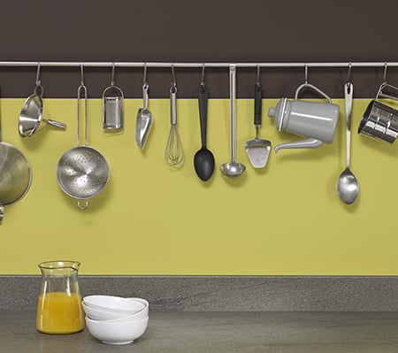
YELLOW KITCHENS
If you’re afraid of splashing colour in your kitchen, a yellow kitchen is one of the best ways to combat neutral tones. Yellow is the colour of happiness so using it in your kitchen helps to create a comfortable environment to socialise with friends and exchange stories across the dinner table. Choose from soft hues like buttercup or primrose or for feature cabinets, go for a statement sunshine layer to create a vibrant focal point for high-end sophistication.
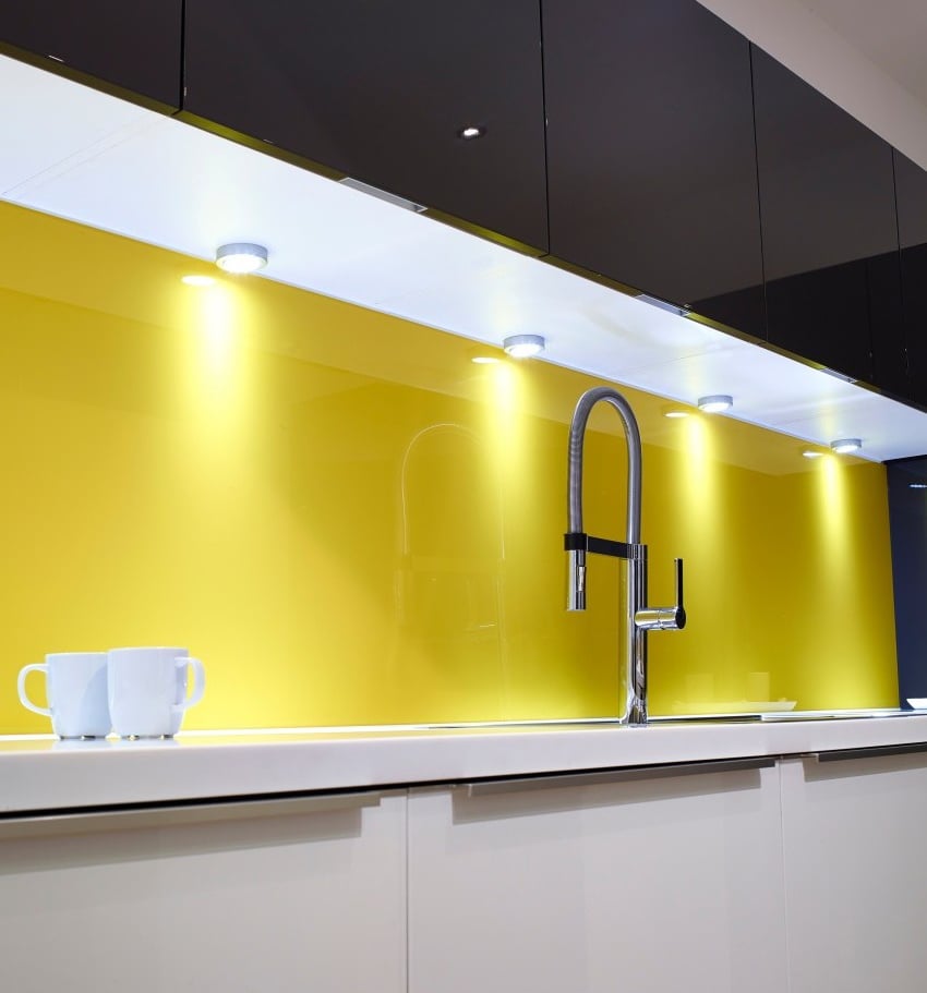
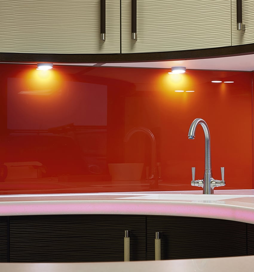
2. STATEMENT SPLASHBACKS
A cost-effective way to introduce colour to your kitchen whilst updating its look is by adding a statement splashback. If you have a contemporary, clean and clinical white gloss kitchen, go for a bright coloured glass or acrylic splashback for a focal point. Splashbacks come in a vast selection of colours, patterns and image designs so it’s a really effective way of creating a feature in your kitchen. For a classic or traditional kitchen, there are many options available, from vintage tiles or for a more industrial effect, stainless steel.
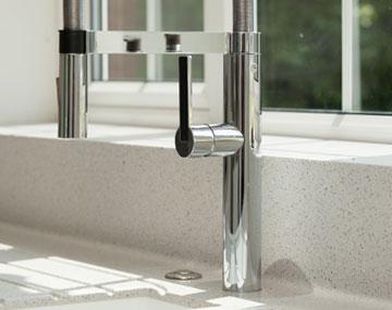
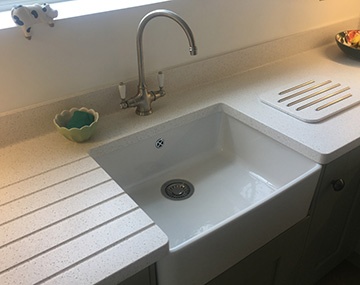
3. COLOURED WORKTOPS
Two things you need to consider when choosing your new worktop are:
- The amount of natural light into your kitchen
- The colour and tone of your kitchen cabinets
Light or Dark?
Light coloured worktops work well in small kitchens or spaces that are lacking in natural light. A lighter surface is more reflective, encouraging the flow of light through your kitchen and gives the illusion of a larger space. Be careful not to have too many accessories placed upon the surface as it can look cluttered. Surfaces are best kept clear for a clean and contemporary look.
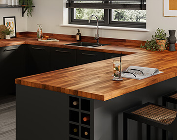
Dark coloured kitchen surfaces are rich in tone and when in a gloss finish, can reflect light nicely around your kitchen. A darker worktop complements light coloured units and works well in large kitchen spaces. A worktop finished in darker tones is a feature in itself against lighter colours.
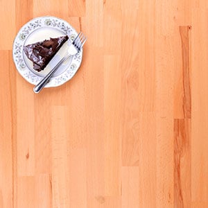
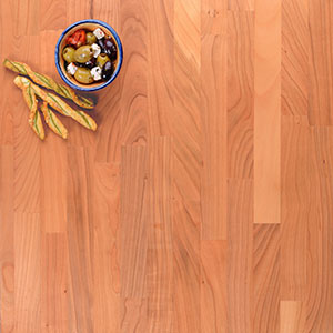
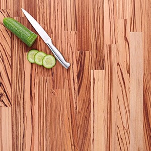
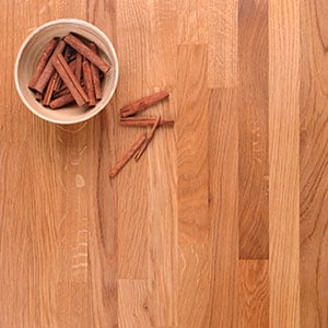
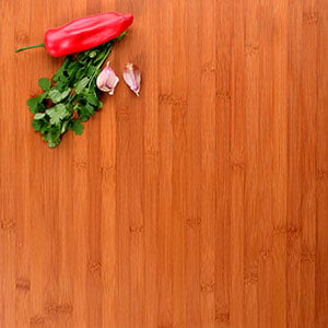
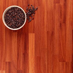
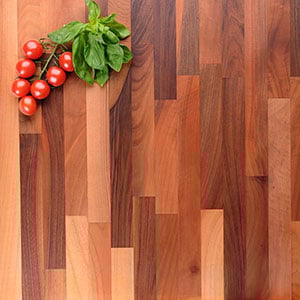
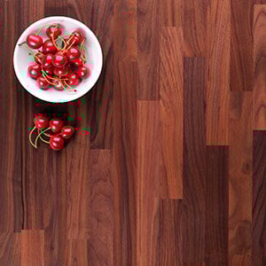
The other option is to opt for a multi-tonal worksurface, that features a range of tones. Below, you can see just some of the multi-tonal wooden worksurfaces we fit. You can find out more about our extensive range of worksurfaces here.
Contrasting Countertops
If you have an island in your kitchen, use a contrasting countertop for a stylish bold feature. The idea of ‘mixing and matching’ your work surfaces offers an opportunity to add depth using different materials and colours.
Texture
Different materials offer different textures which can introduce different tones of colour to your kitchen. Use wooden worktops for natural outdoor colours that complement modern, minimalistic kitchens.
Our seamless worktops are available in monotone and multi-tonal finishes that can be used to complement or bring contrast to your existing colour scheme. This type of worktop offers an array of design options in terms of smooth finish and shape as they can be easily moulded to create curved edges.
Laminate worktops offer the widest range of colours and finishes. Whether you want a granite, quartz, marble-effect or wooden countertop, laminate offers the most flexibility whilst being extremely durable and easy to maintain too.
A popular choice in contemporary kitchen design is Quartz overlay worktops. They can be used to cover existing surfaces, offering a cost-effective solution to update your kitchen and add a touch of colour. Choose from bold multi-tonal surface finishes for a practical work surface for busy family homes.
Choose a natural worktop surface from our Solid Granite and Wooden countertop ranges. Natural products are available in a wide variety of colours, patterns and textures that will easily enhance the look of your kitchen.
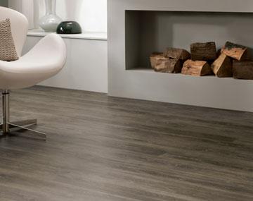
4. FOCUS ON YOUR FLOORING
It’s easy to overlook your kitchen floor but it is a key surface to consider when it comes to choosing its colour. Light coloured flooring is a good choice for small kitchens. It creates the illusion of more space and a more open space. Dark colours with brown and red tones add warmth and create a cosy environment. Darker tones are best suited to larger spaces.
With a wide choice of materials, finishes and colours to choose from, here are a few of our personal favourites for inspiration.
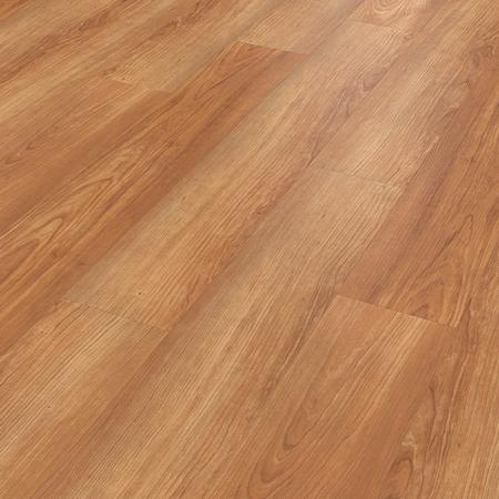
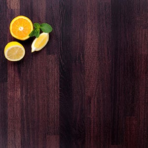
Wood Effect
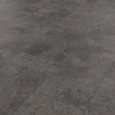
Stone Effect
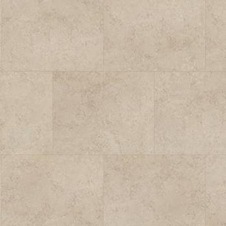
Ceramic tile effect
Top tip: To create a harmonious balance between your kitchen and its flooring, choose a colour based on your worktop surfaces.
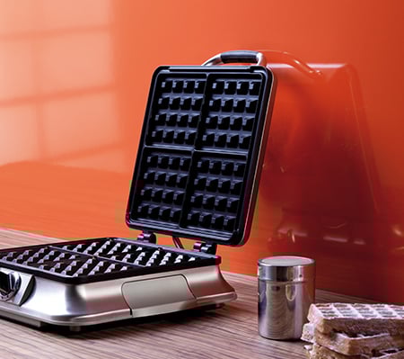
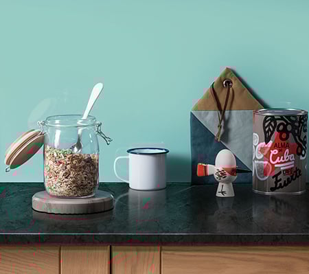
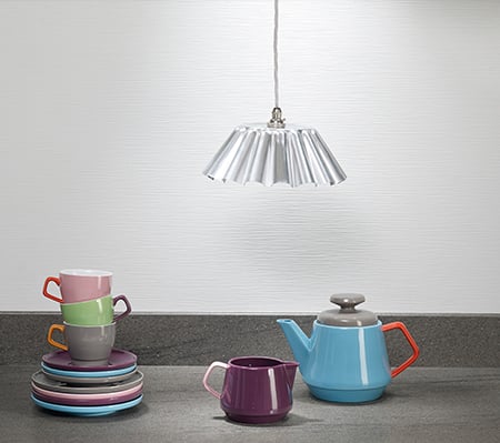
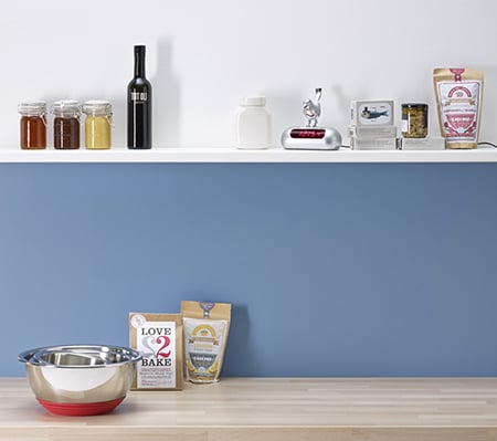
5. ACCENTUATE WITH ACCESSORIES
There are many ways you can introduce colour to your kitchen through a number of different accessories. You may opt for bold design choices and choose a coloured appliance to feature in your space.
Soft furnishings offer a quick and easy way to add a splash of colour. And what’s more, when you want to update your interior, you don’t have to necessarily replace your kitchen, just change the colour of your accessories. Choose patterned fabrics for blinds, curtains, cushions or seat covers. Fabrics can be layered with other textures such as suede, leather and faux fur for added depth.
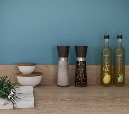
Kitchen crockery and cookware can be colourful. Think coloured or patterned ceramic plates or vintage coloured glasses to add a touch of style.
Accessories can be inexpensive and there are great remakes of pricey ‘interior must-haves’ available. From fake flowers to candles and ornamental figurines, once you have your colour palette, it’s really easy to dress your room.
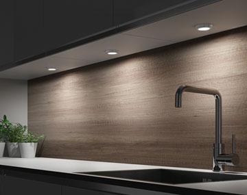
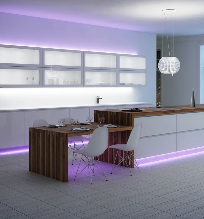
6. LIGHTING
Lighting offers a variety of ways to introduce colour into your kitchen. The use of light in any room can transform the mood and setting. Well-lit spaces are accentuated and give the illusion of wider rooms and larger spaces.
- Recessed lighting: spotlights are commonly used in kitchen areas as the number you install will help determine the amount of light. Use a dimmer light switch to create an atmosphere, changing the shade of colours in your kitchen.
- Pendants: great for illuminating islands and dining areas. Expose the electrical cable hanging from your ceiling for an industrial effect. You can use colour hanging chains, lampshade and bulbs.
- LED strip lighting: this sleek and sublime lighting solution can be fitted almost anywhere. Consider using LED strips under kitchen cabinets at eye level and floor level. Strip lighting is available in a variety of colours and multi-colour options so you can choose a colour to suit your mood.
- Chandeliers: use an elegant chandelier as an accentuated glamorous focal feature. Commonly available in metal textures, one with crystals will reflect light around the room, adding a touch of sparkle. For something more natural, go for a wooden texture to bring outdoor tones indoors.
So there you have it, 6 simple ways to introduce colour to your kitchen. For help and advice on redesigning your kitchen or to just give it a facelift, contact your local Dream Doors showroom to speak to one of our creative kitchen designers.